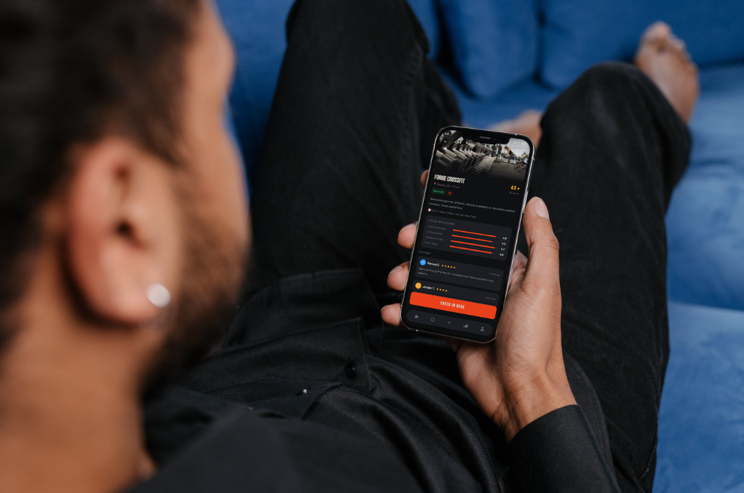
Crossroads
An app for CrossFitters, by a CrossFitter
Role: Solo designer (concept, UX, UI, visual identity)
Tools: Figma, Figma AI (First Draft), Vimeo
Type: Personal / portfolio project
The spark
I've been doing CrossFit long enough to notice the same conversation happening on repeat at my box: someone looking for a partner for the next duo comp, someone new asking which gym in the area actually has good coaching, someone half-joking that they just want to date someone who won't complain about their 5:30am alarm.
Every one of those conversations was happening somewhere different — a gym group chat, a subreddit, word of mouth — and none of it was built for CrossFitters specifically. Strava works for runners and cyclists. Dating apps work for dating. Nothing brings the training, the community, and the competition side of the sport into one place.
So I designed the app I'd actually want on my phone: Crossroads.
Who it's for
CrossFit is unusual among fitness communities in that it's built around relationships — your class time, your judge at a comp, the person who spots your last rep. Crossroads is designed around four things athletes in that world are actually looking for:
A partner for the next competition. Duo and team WODs need someone whose strengths complement yours, not just whoever's free.
A stronger read on their own gym, or the next one. "Good box" means something different to everyone — coaching, facility, vibe, and cost don't always move together.
A record of the work. PRs, WODs, streaks — a Strava-style feed for a sport that's mostly done indoors and undocumented.
A way to meet people who get it. Not every CrossFit athlete wants their app to double as a dating app — so it's opt-in, not assumed.
Designing the core flows
-
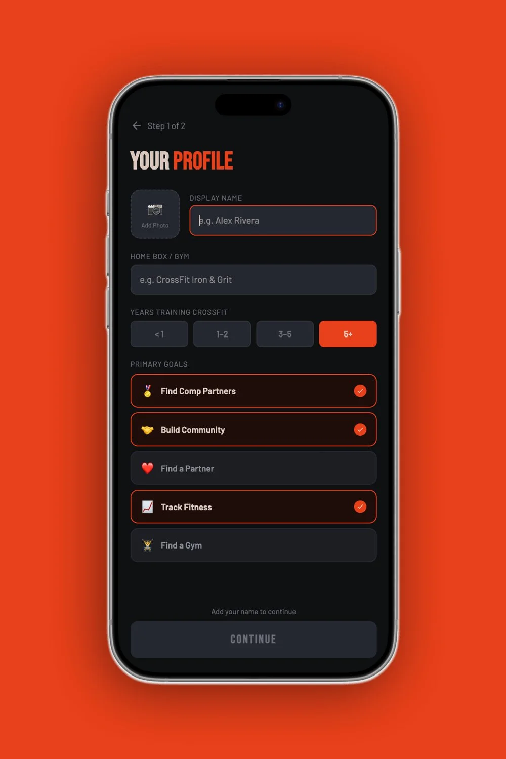
Onboarding asks what someone's actually there for — comp partners, community, dating, tracking, or a new gym — right at the start, so the rest of the app can prioritize accordingly instead of showing everyone the same generic home screen.
-
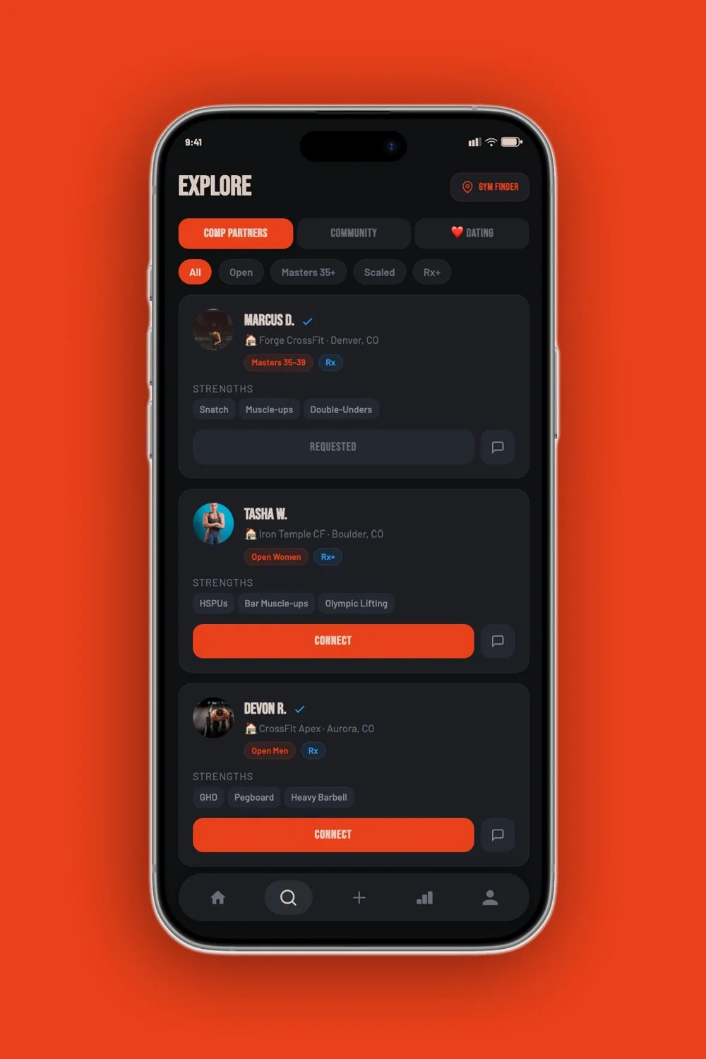
Explore is split into three honest categories — Comp Partners, Community, Dating — rather than blending them into one ambiguous "connect" button. Filtering by division and skill level (Rx, Scaled, Masters) matters more here than it would in a general social app, because a mismatched comp partner is a real problem on competition day.
-
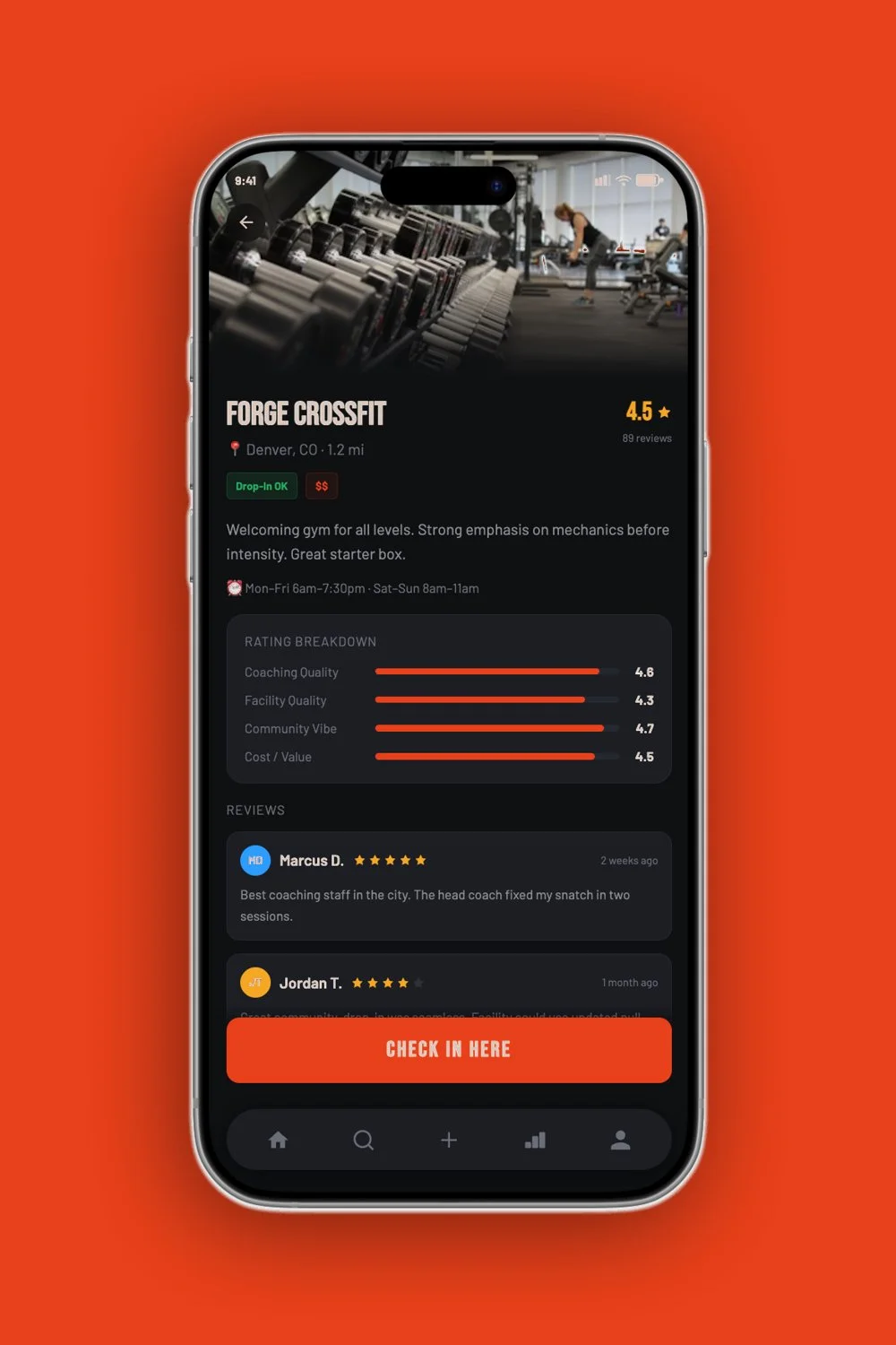
Gym Finder was the feature I cared most about getting right. A single star rating hides more than it reveals, so I broke it into four axes — Coaching Quality, Facility Quality, Community Vibe, Cost — because a gym can nail one and completely miss another, and a five-minute skim of the breakdown tells you more than a headline number ever could.
-
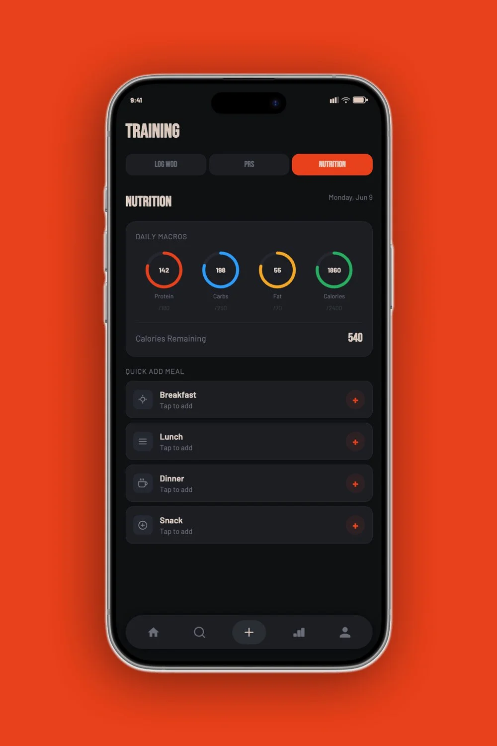
Training (WOD logging, PR tracking, nutrition) and the Feed exist so the app has a reason to open daily, not just when you're hunting for a partner or a new box. Rankings turn that daily logging into something social — friend leaderboards, crews, and lift-specific bragging rights.

Visual identity
The brand needed to read as an athletic performance brand, not a wellness app — closer to Rogue or WHOOP than a yoga studio. That meant a dark UI as the default, a bold condensed wordmark, and a high-contrast orange used sparingly for anything that mattered (PRs, primary actions, live states).
For the mark, I went through a few directions — an abstract intersection glyph, a rough chalk-textured X — before landing on two crossed barbells. It's the most literal option of the set, but for a sport this specific, literal read as more confident than clever.
Process notes
I used Figma's AI drafting tools to get from concept to a full set of screens quickly, then went through and rebuilt the parts that mattered for consistency — component reuse, spacing, the rating-breakdown pattern reused across gym cards and gym detail, the badge system on profile. The AI draft was a fast first pass; the actual design judgment was in deciding what to keep, what to rebuild, and what a real athlete would actually tap first.
What I'd explore next
This is a concept piece, not a shipped product, so the obvious next step would be validating the two riskiest assumptions with real athletes: whether people actually want dating folded into a training app at all (even opt-in), and whether the four-axis gym rating is more useful in practice than it is in theory, or just more work to fill out. Both are the kind of thing you can only really learn by putting it in front of the people it's for.
Crossroads is a personal concept project exploring what a community app built specifically for the CrossFit community could look like — not an app currently in development.